Do you want to learn what is a Lightbox in Wix and how it transform your website's user experience, and grab your visitors' attention like never before? Welcome to the fascinating world of Lightboxes providing a more engaging and focused content delivery system.
In this comprehensive guide, we'll demystify what is a lightbox, delve into its unique benefits, and uncover how it's revolutionized the way content is displayed. Then we will discuss the features that differentiate Lightbox from the regular Popups and overlays.
But that's just the beginning. I'll also walk you through a simple 6-step process to seamlessly add a Lightbox to your Wix website, making sure it aligns perfectly with your brand and purpose.
Ready to elevate your web presence and engage your audience like never before? Let's dive into the powerful potential of Lightboxes.
Understanding: What is a Lightbox?
A Lightbox in Wix enhances website functionality. It provides an interactive layer over the main content, capturing visitor attention for specific purposes.
Whether showcasing a promo, collecting email sign-ups, or displaying media, Lightboxes offer a seamless, focused viewing experience without navigating away, thereby enriching user engagement and interaction on Wix sites.
Definition and Explanation of a Lightbox
On Wix, you can customize the Lightbox in terms of design, content, triggers, and display settings, ensuring it aligns with your site's aesthetics and purpose.
Now, I'll present an accurate definition of the Lightbox, followed by a detailed explanation.
Definition of a Lightbox:
A Lightbox is a graphical user interface (GUI) feature that displays images, videos, or other content using an overlay on top of the current page content, dimming the background and directing the viewer's attention to the overlaid content.
Explanation of a Lightbox:
- Purpose: Lightboxes are primarily used to showcase multimedia content without redirecting the user to a new page. They provide an "in-context" view, allowing users to remain on the current page once the Lightbox is closed.
- Interactive: Lightboxes often come with navigation features, especially when they're used to display a series of images or videos. This allows users to cycle through content without exiting the overlay.
- Responsive: Most modern Lightboxes are responsive, meaning they adjust to screen size and orientation, ensuring a consistent viewing experience across devices.
- Engagement: By focusing the user's attention on a particular piece of content, Lightboxes can enhance user engagement, making them ideal for highlighting promotions, announcements, or detailed views of products.
- Flexibility: Beyond images and videos, Lightboxes can be used to display forms, such as sign-up sheets, contact forms, or feedback sections, providing an unobtrusive method for user interaction.
- User Control: Typically, Lightboxes can be easily closed by the user, either by clicking the close button or pressing the escape key, giving users control over their browsing experience.
Differentiating Lightbox from Regular Pop-Ups and Overlays
Brief Historical Context: Evolution of Lightbox in Web Design
- Early Web Pop-Ups: Before Lightbox, the web was familiar with pop-ups. However, they often opened in new browser windows and became notorious for their overuse of intrusive advertising.
- Flash Era: During the mid-2000s, Flash animations enabled smoother transitions and pop-up-like features. This period marked the genesis of lightbox-like effects, though they were mostly Flash-based and not universally accessible.
- Introduction of Lightbox: The term "Lightbox" was coined around 2005 when a web application used it to display images in a modal dialog, dimming out the rest of the screen. Its user-friendly nature and aesthetic appeal quickly caught on.
- jQuery and Modal Plugins: The rise of jQuery in the late 2000s popularized Lightbox, with several plugins developed to simplify its implementation. This made the Lightbox effect more accessible and customizable for web designers.
- Responsive Design: With the explosion of mobile browsing in the 2010s, Lightboxes had to evolve. They became more touch-friendly, ensuring compatibility across devices.
- UX Evolution: As user experience (UX) became central to web design, Lightboxes were optimized to ensure they weren't disruptive. The focus shifted to user engagement, leading to more interactive and user-friendly lightbox designs.
Why Use a Lightbox on Your Wix Website?
- Immediate Engagement: One of the primary reasons to use a Lightbox is to capture the user's attention instantly. As soon as visitors land on your site, the Lightbox can present them with vital information, promotions, or calls to action, ensuring that the main message is not missed.
- Focused Content Delivery: With the rest of the webpage dimmed, a Lightbox effectively highlights specific content, ensuring that visitors see and process it without any surrounding distractions. This focus can increase comprehension and engagement rates.
- Improved User Experience: Lightboxes offer a seamless way to view content without navigating away from the current page. Whether it's an image gallery, a video, or a form, users can interact with the content and easily return to their previous spot, enhancing their browsing experience.
- Lead Generation: For businesses looking to grow their email list or gather more information about their visitors, Lightboxes are a tried-and-true method. With a compelling call-to-action and a simple form, these are effective tools for generating sign-ups and inquiries.
- Promotions and Announcements: When you have a sale, special offer, or important news, a Lightbox is an excellent tool to spotlight that information. It ensures that visitors are immediately aware of ongoing promotions or announcements, increasing the chances of them taking action.
- Mobile Optimization: In today's mobile-first world, having tools that are optimized for smaller screens is crucial. Lightboxes on Wix are mobile-responsive, ensuring that content looks and functions perfectly across devices.
- Customization: Wix allows for extensive customization of Lightboxes, ensuring they align with your brand aesthetics and serve their intended purpose effectively.
- Analytics and Tracking: By integrating with tools and plugins, you can track how your Lightbox is performing, giving insights into user interaction and helping in refining strategies for better engagement.
Steps: How to Add a Lightbox in Wix
Let's dive into a 6-step guide on how to incorporate a lightbox in Wix. Accompanied by clear screenshots, I'm confident this walkthrough will provide a comprehensive understanding of the process. Ready to embark on this journey? Let's get started.
Step 1: Navigate to the "Add" or "+" option in the Wix editor
Firstly, you need to click on the Edit site then you can access your website's editable dashboard. This will help you to utilize many options to add functionality.
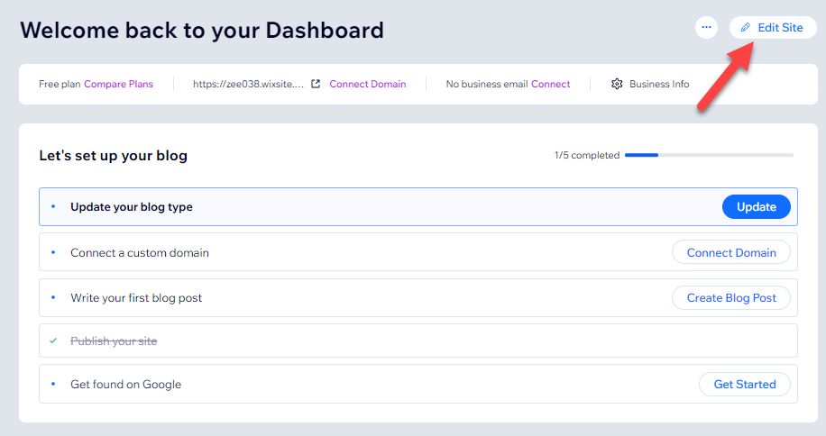
The first step to add a lightbox you need to click on the “+” button at the top of the Wix dashboard.
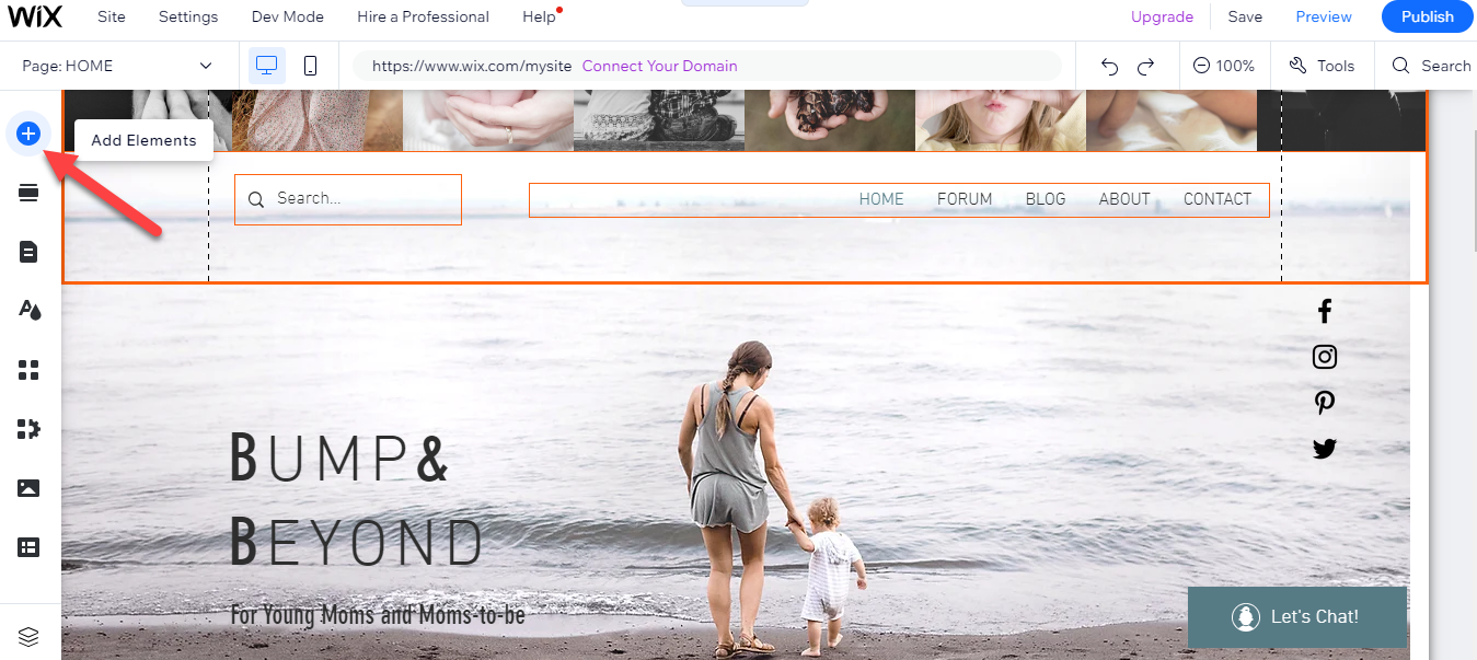
Step 2: Choose "Interactive" and select "Lightbox"
When you select the "add element" option, proceed to the "interactive" choice. Once there, click on "Lightbox" to continue.
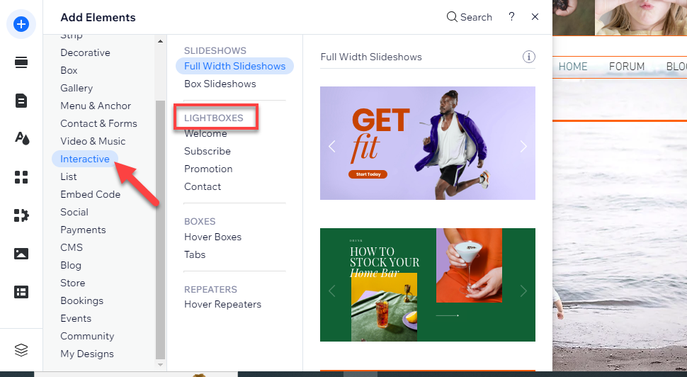
Step 3: Browse and Select from the Available Lightbox Templates
Various lightboxes are now at your disposal for integration into your Wix site. Based on your needs, select a popup from the promotion, contact, or subscribe options.
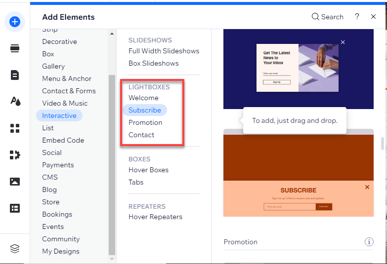
Step 4: Customize the Design, Content, and Triggers for your Lightbox
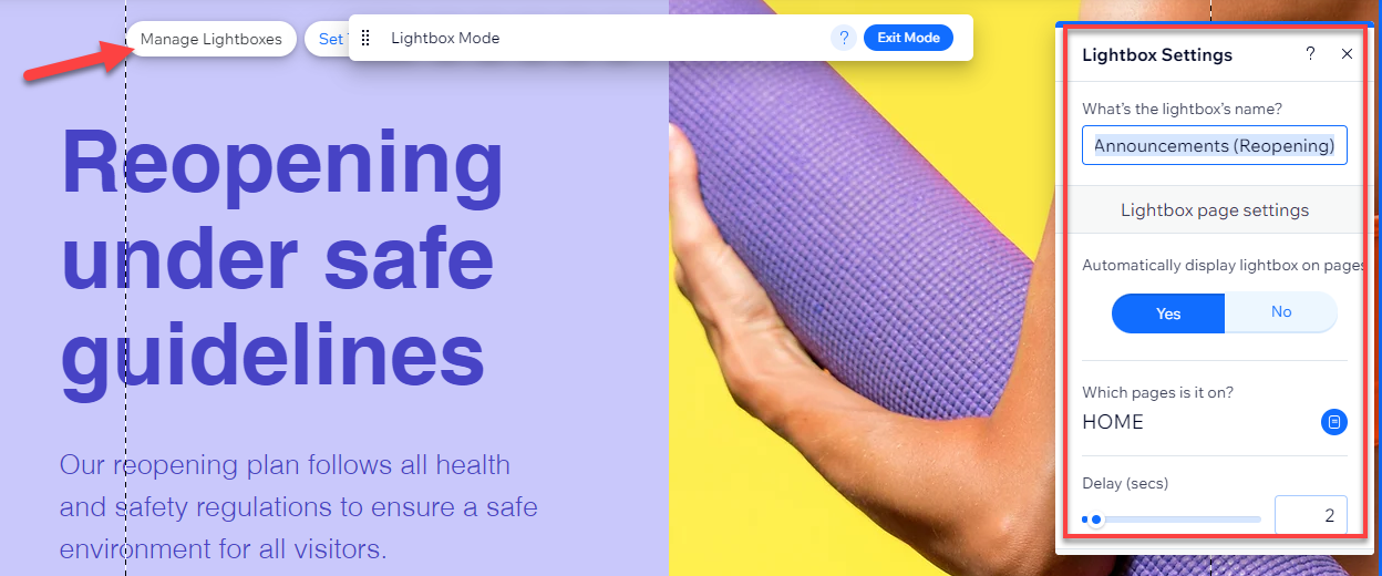
In Wix, the Lightbox is designed for customization. You can tailor the content's design to align with your brand, adjust the background color to complement the aesthetics, and even modify the close button animation for a unique user experience.
This flexibility ensures that your Lightbox not only serves its functional purpose but also harmoniously fits into your site's overall design. To customize it click on the “Manage Lightbox.”
Learn More: Do you want to learn How Does Wix Work? Learn the Use of Wix Editor & Wix ADI.
Step 5: Preview and test the Lightbox on your site
Once you've adjusted the necessary settings, take a moment to preview the implemented lightbox.

Step 6: Save and Publish Your Changes
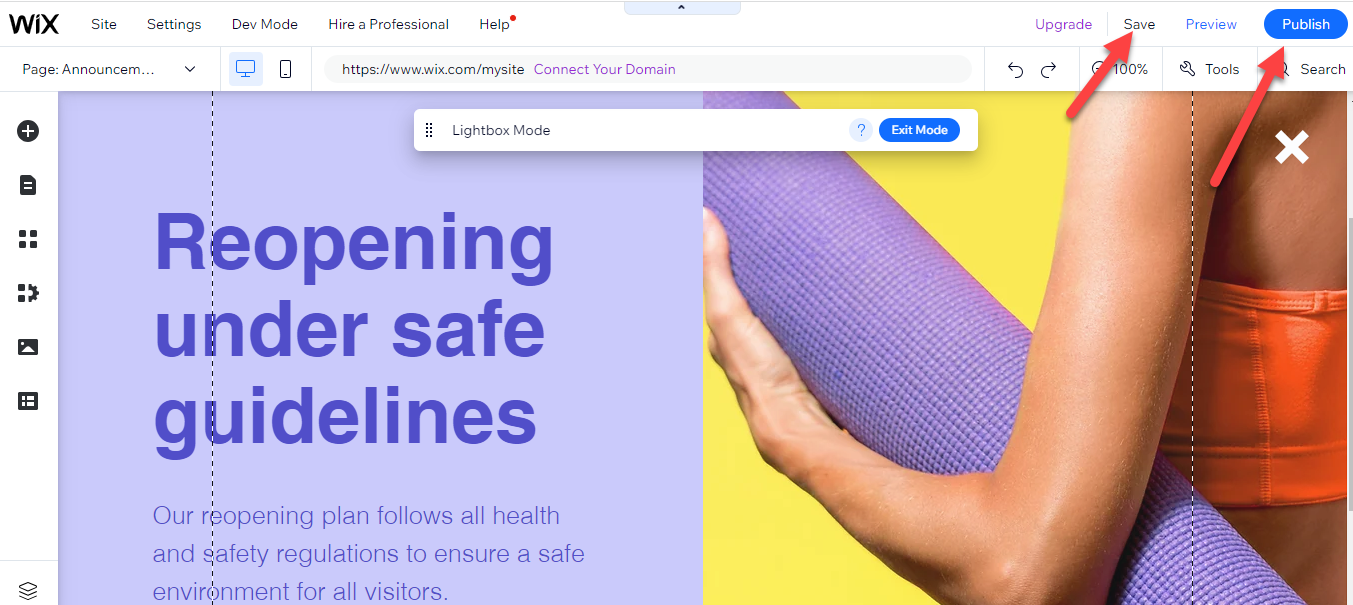
If the preview meets your expectations, proceed by clicking 'save' and then "publish" it to your Wix site.
Related blog: How to Add a Popup on Wix.
Advanced Lightbox Tips for Wix
- Responsiveness:
- Optimize for All Devices: Test your Lightbox on various devices, including smartphones, tablets, and desktops, to ensure a consistent look and feel.
- Flexible Design: Use flexible grids and scalable images to ensure your Lightbox adapts to different screen sizes.
- Mobile-First: Given the prevalence of mobile users, prioritize the mobile version of your Lightbox. Ensure buttons are touch-friendly and text is legible.
- Timing and Triggers:
- User-Friendly Timing: Avoid showing your Lightbox immediately upon page load. Giving users a few seconds ensures they won't be overwhelmed or disrupted.
- Engagement-Based Triggers: You can display the Lightbox when a user scrolls a certain percentage of the page or stays on the site for a certain period of time.
- Exit-Intent Technology: Utilize this feature to display the Lightbox when a user is about to leave your site. This can be a last-minute hook to capture their attention or details.
- Content Tips:
- Conciseness is Key: Your Lightbox content should be straight to the point. Long-winded text can deter users. Use compelling headlines and succinct body text.
- Clear Call to Action (CTA): Ensure your CTA is evident and compelling. Whether you're asking users to sign up, purchase, or read more, the action should be clear.
- Relevance: The content in your Lightbox should align with the page or content the user is currently viewing. For instance, a Lightbox on a product page might highlight a special offer for that specific product.
- Imagery: Use high-quality and relevant images or graphics. Visual elements can enhance the appeal and effectiveness of your Lightbox.
- User Control:
- Easy Exit: Always ensure users can easily close the Lightbox if they wish. Whether using the classic 'X' icon or an evident 'close' button, the exit option should be apparent.
- Limit Frequency: If a user closes the Lightbox, consider not showing it to them again for a specific duration. This avoids annoying repeat visitors.
- A/B Testing:
- Optimize Performance: Regularly test different versions of your Lightbox to see which performs better in terms of user engagement and conversions.
- Variations: Experiment with different CTAs, images, text, and triggers to find the most effective combination for your audience.
Wrapping Up
The Lightbox is a powerful feature that significantly boosts a website's functionality and user experience, especially on platforms like Wix.
Acting as an interactive layer, the Lightbox effectively captures the visitor's attention, providing focused content without redirecting them elsewhere.
The strength of this tool lies in its versatility, from showcasing promotions to collecting sign-ups and displaying multimedia. Wix's Lightbox customization options further add value, allowing users to tweak design and triggers to fit their brand's aesthetics and objectives.
History reveals Lightbox's journey from its inception, replacing the infamous pop-ups, to its evolution alongside the growth of Query and the prioritization of user experience. Integrating a Lightbox into a Wix site can seem complex, but following a step-by-step guide, it becomes a breeze.
This journey culminates in a beautiful, functional, and interactive element that significantly enriches user engagement.
However, to maximize its potential, it's essential to consider advanced tips like ensuring responsiveness across devices, using user-friendly triggers, and keeping content concise.
Testing and optimizing the Lightbox ensures it aligns with user preferences and meets desired objectives. In essence, understanding and utilizing the Lightbox effectively can be transformative, providing visitors with a seamless, engaging, and interactive experience.
FAQs
What is a lightbox, and how does it work?
A lightbox is a web design feature that displays images or content prominently on a page. When activated, it dims the rest of the webpage and brings focus to the content displayed in the lightbox, usually an image, video, or form. This is achieved through JavaScript and CSS, where the lightbox content is overlaid on the current page, allowing users to view the content without leaving or reloading the page.
Is the lightbox free to use?
Many lightbox features are available as free plugins or components in popular web development frameworks and content management systems. Some advanced or specialized lightbox features might be part of premium packages, but the basic functionality is generally free.
What is a website lightbox?
A website lightbox is a graphical control element commonly used on websites to display pictures, videos, or text in a focused and prominent way. It's a way to present information without navigating away from the current page, enhancing user engagement and keeping the viewer's attention on the site.
What is a lightbox popup?
A lightbox popup is a type of lightbox that appears in the form of a popup window within a webpage. It is typically used to display messages, advertisements, forms (like newsletter signups), or other content. This popup activates when a user performs a certain action, like clicking a button or after spending a specific amount of time on the page.
What is the purpose of a lightbox?
The primary purpose of a lightbox is to improve user experience by focusing the user's attention on a specific piece of content without navigating away from the current page. It's used for showcasing images or videos, capturing user information through forms, displaying notifications or offers, and minimizing user distraction by dimming the background content.


.svg)